Calling all you creative/artistic/style master types!!
vassy66T1 - September 16th, 2013 at 09:18 AM
Hi
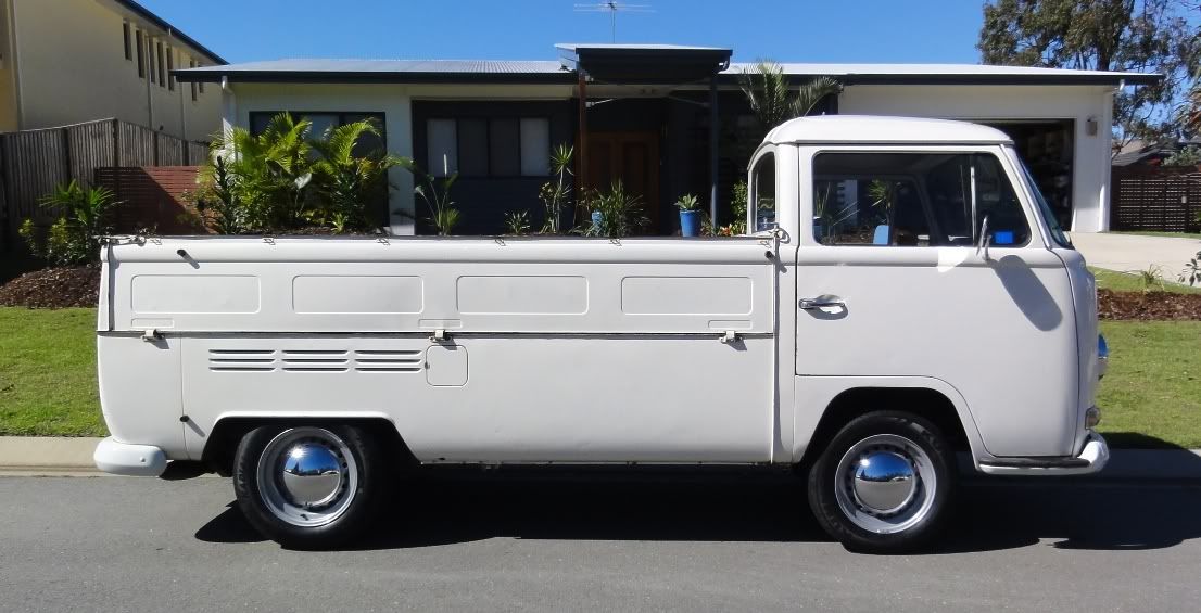
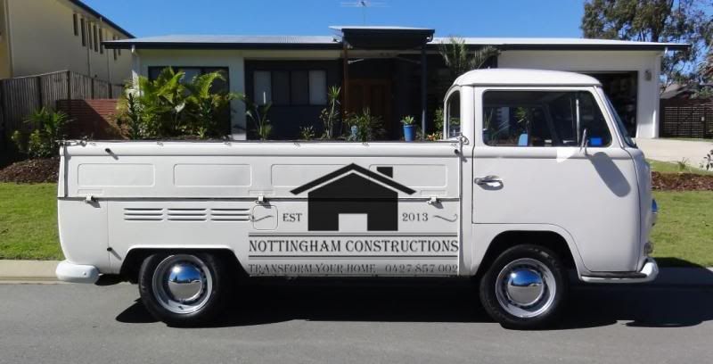
I am looking for some input and help in achieving a logo/signwriting that I am happy to put on my Single Cab for my building business.
I want the design to be:
- Clear, simple, easily legible (not too cluttered)
- In keeping with the style/era of my ute
- I want the ute to look better (not worse) with the signwriting on it.
- containing the following info:
- Nottingham Constructions
- Transform your home
- 0427 857002
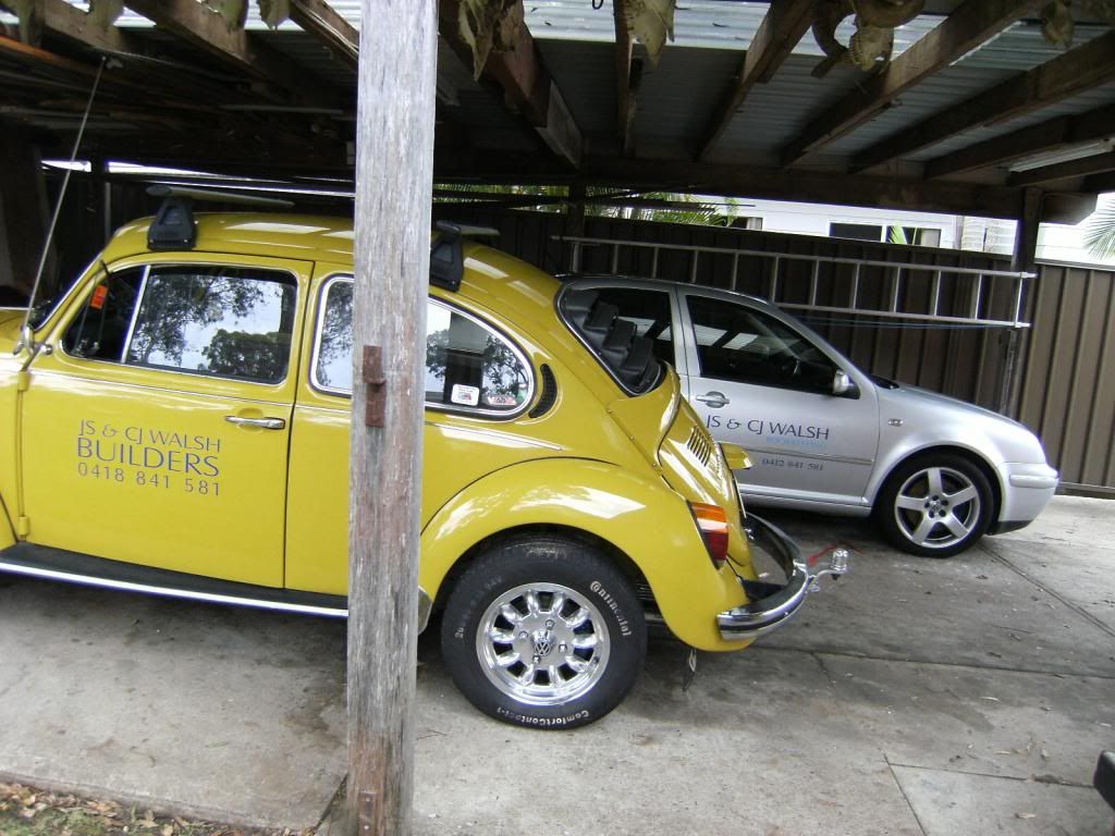
I really like the style of this coffee logo/sign.
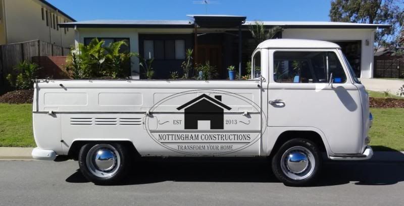
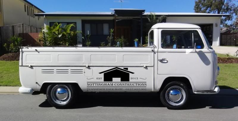
Also below is my ute with a logo that is getting close but not spot on.
Your help is appreciated. If this is your profession (or what you prduce is sensational) then I am willing to pay. 
Marcus


Sides - September 16th, 2013 at 09:49 AM
Why Nottingham... is there some Robin of Locksley link to your past that you've not let on about ???

Put up a better picture of the ute and I'll see what can come up with...
vassy66T1 - September 16th, 2013 at 12:29 PM
My ex business partner was born there, so no real connection at all now, but will stick with the name as I have traded with it for 10 yrs now.
Thanks Dave

Craig Torrens - September 16th, 2013 at 06:11 PM
Does that font suit your target market, and does it depict the style of work you do ?
vassy66T1 - September 16th, 2013 at 06:47 PM
Good questions Craig.
The font that suits the business well (IMO) is the one just below that I used for our logo and banner etc. when I did a stand at a recent home
show.
I chose it because to me it was a little bit contemporary and maybe had a bit of an edgy feel i.e. some sense of style.
However I don't think it suits the vehicle at all.
The style of renovations that I undertake are incredibly varied. I really just thought it was time to make the most of the amount of attention and
interest that the ute gets.
I don't want to spoil the look of the car.

Happy to hear thoughts.
Disclaimer: I am not a marketing guru and have not had the logo professionally designed. I do however know what I think looks good and crap.
Sides - September 16th, 2013 at 07:08 PM
So for font's Marcus... any of below grab you ???
(the second 5 are the same fonts, but with 130% Vertical Scale to get a bit more of a retro feel)
Turbo54 - September 16th, 2013 at 07:46 PM
Hey Vassy, this is what I do for a job. Look at letterpress print sites as they will point you in the direction. Call me if you would like me to look
at it.
Heath 0434 943 058
vassy66T1 - September 16th, 2013 at 07:47 PM
No. 3 is the one that attracts me.
Probably in the 130% vertical scale
Dak-A-Tak - September 16th, 2013 at 08:21 PM
Something done in the year'ar of you ute , would be cool . Depends if you want black & white or colour logo to .
Turbo54 - September 16th, 2013 at 08:28 PM
I think all of those fonts look old and dated, no offence.
Look at San serifs or slab serifs if you want that style.There is a abundance of options.
You could do some cool stuff with tools of fixings woven into lettering.
T54
beetleboyjeff - September 17th, 2013 at 12:50 AM
This is what I have on my 75 L bug if that is any help.

Sides - September 17th, 2013 at 07:44 AM
Bit of a tough one Marcus... finding it hard to get balance across all the words !!!
70's signwriting seems to have mostly been big, bright and blocky... but that doesn't really suit the style/colour of an SC (but would be great on a
panel)... so thinking head a bit further back into 60's style ???
Nothing fancy or flash, but I kinda like it....
matberry - September 17th, 2013 at 07:51 AM
I'm partial to my first offer Marcus, maybe throw that up for more ideas
vassy66T1 - September 17th, 2013 at 07:58 AM
Personally I am happy with the logo for the business (we have it on letterhead, shirts etc already) but feel that what goes on the ute can be
different in style as it relates to the car and is in it's style/era.
I appreciate any and all input as it helps the creative juices.
vassy66T1 - September 17th, 2013 at 08:05 AM
Thanks Dave. As I said, all ideas and designs help me move closer to something that I will be happy with.
I also agree that the length of the Company name provides some challenges for a tasteful design.
Sides - September 17th, 2013 at 08:07 AM
No probs Marcus.
Are you wanting to just stay on the doors, or are the gates etc. fair game also ?
vassy66T1 - September 17th, 2013 at 08:19 AM
I don't think the gates are out of bounds. I will definitely be putting something on the back gate so people following can read it in our great
Brisbane traffic.
I do have new gates going on soon so they will be nice and straight 
esevwbits - September 17th, 2013 at 11:24 AM


our IT guy is bored shitless today - stock image for logo used.. he'll happily design to your specs and V cheap 
Sides - September 17th, 2013 at 11:51 AM
Heh - ditto the being bored shitless !!!
How about going even more retro ??? (back into the 50's)
vassy66T1 - September 17th, 2013 at 02:43 PM
I am putting up some more logos/signwriting that appeals to me
These first six examples (in the first pic) have a cool style in my eyes


This one appeals to me in it's style

I like the reverse of the colours in this one (white text in coloured box and then coloured text)


This is just one I tried myself

hrastovica - September 18th, 2013 at 01:48 PM
I am a graphic designer, however i would like to recommend another designer who works in this style (and he is a VW dude). Speak to Ross from Skinned
Knuckles... definitely his thing http://www.skinnedknuckles.com.au (does
beams and stuff)
Dasdubber - September 18th, 2013 at 08:50 PM
Hey Marcus,
If you decide to enlist the help of a pro (eg. Ross recommended above), we have used Wayne Periera (graphic designer) over in WA for both our logos
(DAS Resto Haus and Parts), plus all our advertising material and design. He is a VW guy too which helps a lot for our businesses, but he is very easy
to work with. wpdi@iinet.net.au if you do want to shoot him an email. Branding is extremely important as you would know already of course, so
certainly helps to get it all to gel together.
Cheers
al
theVman - September 19th, 2013 at 12:19 AM

vassy66T1 - September 20th, 2013 at 07:33 AM
Thanks all.
I have Heath working on this for me at the moment.
I will update when it gets closer to finalised.
I do appreciate the AVD community. 
Bizarre - September 20th, 2013 at 08:31 AM
What about splitting the logo up?
Have a strong but simple logo on the door - something simple but recognisable. Like what you would put on a polo shirt.
Then have all the details on the gates
Barry
Sides - September 20th, 2013 at 10:35 AM
Just noticed how long the tray is on your SC... looks like could be perfect for putting 4 rims into and bringing with ya on Sunday perhaps ???

(if ya can would be great, but no pressure dude)
ian.mezz - September 20th, 2013 at 10:47 AM
signs need to be easy to read.
the phone number should be big.
no good being to fancy, if people have to look at it to long to work out what you are selling.
Handy - September 28th, 2013 at 07:09 AM
By experience I can tell, keep it clean and big , not a lot of phone numbers and small text. See it with the viewers eyes (a possible client).
"Nottingham construction" and "transform your home" shall be big and easy to see/read on distance or when you are passing by on the road. Nobody
can see a small sign on a door, especially not with a lot of information. A good web address is so much easier to remember than if you see a phone
number passing by. It might be good to have a phone number on the vehicle, but that can be smaller, it's something that people see when the vehicle
is parked.
HappyDaze - September 28th, 2013 at 07:41 AM
| Quote: |
Originally
posted by Sides
Heh - ditto the being bored shitless !!!
How about going even more retro ??? (back into the 50's)
|
This will do the job...tells you all you need to know, easily and quickly.
Turbo54 - October 2nd, 2013 at 12:33 PM
Hi Marcus,
Sorry I haven't got back to you, resigned from my job and disappeared bush for a week, I got back late last night and will be finishing off a few
concepts tonight.
I will email direct.
Heath


